Archive for the ‘graphics’ Category

Upgrade Ahoy!

So I decided that instead of spending the money to buy myself the laptop (see previous posts), I’d dump it into a computer upgrade for myself. Its been a long time in the waiting, and I figured I’d do it right. Read more

Share

Ice Theme

So I wanted to try my hand at creating a CSS theme, and if you’ve switched to the Ice theme then you’re looking at it right now.

I’m really pleased with the way it turned out. I’d love to hear your feedback though, please leave me comments on this post!

Share

Back Tattoo Images

It occurred to me, after receiving an email from Crispin, that I hadn’t put up any of the more recent images of the back tattoo work. It is, in fact, done now. Please note, that in the below images, where you see ‘red’, it isn’t the color of the ink. That is just how skin behaves when you puncture it thousands of times with little needles, and the blood comes closer to the surface of the skin. So, I submit, for you approval or loathing…

Update (9/28/2011) … just linking straight to the gallery.

Note, I need put up one final image from now, which will have everything the right color and shading and such, and I’ll get to that soon. And for reference, the kanji in the small scroll thinger on the left hand side are three pairs for ‘truth’, ‘honesty’ and ‘compassion’.

Share

Compositing

I’ve mentioned making wallpaper images using a technique I called “compositing”. I’m sure it has some other name that makes sense just as well, but thats what I call it. For those who crave such a technique, I’m happy to share. I suppose I’ll just discuss it in the general sense, and then provide a very specific example from one of the images in the gallery.

Honestly, this isn’t brain science or anything, just a whacky technique thats easy and produces some (imho) very nice images to look at. Ok, basic principle.

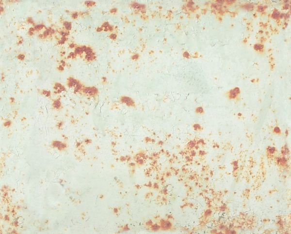
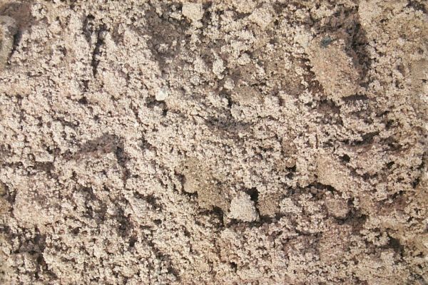
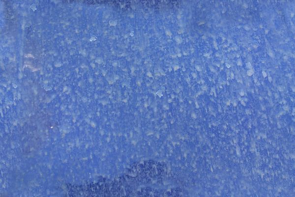
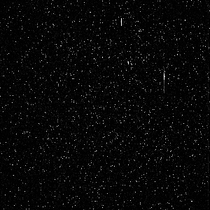
The first task is to go browsing the Intranaut for images that are appealing to you. The ones that I find that work best are pictures of natural settings with one consistent structure to the whole image. As some examples, I will show you a picture of some rusted metal, some sand, a rock wall and the side of a dirty car. Again, notice that each image doesn’t contain a huge variety of content. Each sticks to one theme, and has consistent elements throughout.

These images aren’t really all that notable in and of themselves. They key is in the layering. Next take your favorite image manipulation program. Make sure it supports layering, and having each layer act as a filter. Personally, I use Paint Shop Pro, and have for years. To each their own.

Next: Open your graphics program of choice, and open a new image of whatever size you want. I almost always start with a blank, black 1600×1200 image, figuring that I can scale down from there to whatever size I want later. Open all your ‘sampled’ images as well, and RESIZE them to the same size as your target image. I generally ignore scale here, it isn’t important in the sampled images.

Start with a base color. Pick a color that is generally pleasing to your eye, and just paint that color into your background layer as the base color. Now, for each of your sampled images, copy and paste it into your target image as a new layer. With each of these layers, change the filtering type and percentage until you arrive at something that looks good to you. Repeat for each image.

What I mean by ‘filtering type’ is how the new layer affects the image. Yes, it is a picture and you’d think you’re just overlaying that image onto your background color with a certain opacity, big deal. Well, yes and no. The filtering type ‘Overlay’ is certainly an option, but there are many others. For example: Darken, Lighten, Hue, Luminance, Multiply, Hard Light, Soft Light, Dodge, Burn, etc. Each of these filtering types will take your sampled image, and affect whats behind it a different way.

I normally spend the majority of my time in this step. With each layer, I go through ALL the filtering types, and with each type, vary the percentage of effect (opacity, to use the same analogy) from zero to 100%. Even if I find something pleasing to the eye, I always go through all the filter types anyway. I come up with a mental list of the two or three I liked, and once I’ve completed the whole list, I go back and reevaluate the couple that were the most appealing.

Once thats done, lock down the layer, and go get the next example image. Repeat until you’re done. There are occasions when I don’t use one of the sampled images because none of the filters strike me, or occasionally change the order of the layers to get a different result. Experimentation here is key, it will reward you eventually. I may also, as a final step, introduce a darken/lighten layer, or a contrast type thing to improve the overall brightness of the image, but usually not. Thats it!

So for a specific example, check out the moss image in gallery three. The example images I selected earlier are the ones used to make this one. Here’s the exact process:

Background color is a dark green (#004040)
First layer is the old metal image, Burn filter, 100%
Second layer is the sand one, Burn filter, 16%
Third layer is the brick wall, Hard Light filter, 26%
Fourth and final layer is the auto dirt one, Dodge filter, also at 100%

voila. I’m particularly pleased with that one. It took about 5 minutes (quite literally) to make. It all just bolted together very nicely. Please feel free to comment or add your own thoughts about this if you like. I’m curious what other sorts of magical techniques people use to make nice backgrounds and wallpapers.

What I think is the most appealing about this technique is that since each of the images used is itself a very natural (or pseudo natural) image that could easily occur in nature, the resultant image also looks very natural. The moss one in particular reminds me of what you might see on a moss covered rock underwater, with some specular highlights that might be some sort of phosphorescent part or little glowing thinger. Also, once you’ve seen the images used to create it, you can usually just about pick out the effects each of them had, but without that knowledge there really is no discernible “order” to things, or any way to really see what makes up the image. Dig it. Give it a shot!

Share

Wallpaper, ho!

I think I’ve got all those images linked in nicely now. The ‘methuselah’ tag on the right is links to any image galleries I’ll add here. So its not completely based on CSS (it uses tables), and so its not automatically integrated with the image program of choice and probably a dozen other features the fancier things throw in. Big deal. It works for me.

When I get a free minute, I’ll create thumbnails for the back tattoo images, and throw those in as well. Good enough for now.

Share

Methuselah Gallery Three

Update (9/28/2011) … linking straight to the gallery.

Share

Methuselah Gallery Two

Update (9/28/2011) … linking straight to the gallery.

Share

Methuselah Gallery One

I’m going back and editing these posts (9/28/2011) and now I’m just going to link to the gallery.

Share

Animation

Content from old… this one is an animation I put together from the individual images photographed from a Leonid meteor shower awhile back. Note, the image is over 1Meg in size, for those of you bandwidth impaired.

Here’s the Image!

Share

Recoloring

So yeah, I eventually agreed that my colors were all too dark and stuff. So now it looks like this. After some tweaking and playing and getting good feedback from others (Thanks Dar/Grey/Lore!), I’m once again pleased with the layout and appearance.

Until the next time I get sick of it.

<update time=”2004-9-1 21:22:04″>
I once again refer back to this site and the work of B A Khan for his Dark Fire template. Sorry for not including the credits up front. I’m such a slacker.
</update>

Share

Online comics

I was a comic page reader from way back. I grew up on Peanuts, Garfield and later discovered Calvin and Hobbes, the Berke Breathed efforts and the more politically geared works like Doonesbury. My current active reading list is just three. They’re listed in the links on the right. This topic deserves more discussion than my brain is willing to give it right now, but I will get back to this in the future.

Share

Generally speaking…

Once again, in an effort to start moving stuff from my old site to this one, here’s a general post regarding graphics. This one will hopefully get quite a bit more attention as time goes on.

It is true, as I mentioned almost 4 years ago in that original posting, that I’ve always been fascinated by the visual aesthetics of things. I think, with the possible exception of people who are born blind, that everyone, likewise, does have a certain ‘taste’, in art. Color combinations they find appealing, shapes and overlay and combinations of layers that strikes them as pleasing to the eye, and such. I would also say that most people never really develop this sense. They simply accept what they perceive as fact, and never delve into the hows or whys of it, nor do they ever really find any way to enunciate it clearly, or find particular art or artists that particularly exemplifies the things they like.

I won’t say I’m any expert in art. Far from it. I’d say I’m more in the ‘discovery’ phase of things. I do know some artists that I particularly enjoy…. Escher, Dali, Klimt, Giger and Mandlebrot, to name a few. Don’t know that last one? Well … it is definitely a name that doesn’t really belong with the others, at least in the traditional sense. But it does bring out one aspect of art that I’m particularly fond of. Benoit Mandlebrot was one of the formative scientists in the field of fractal, or chaos theory. One of the more popular ‘sets’ of data, or more accurately, formulas describing data is named for him as well.

Eventually, I’ll link in several of the research documents on fractal theory for those who want to pursue it deeper. In the meantime, go google it and see what turns up. The crux of it though, is that these researchers were finding ways to describe patterns they observed in nature, in seemingly random things (cloud patterns, for example), with formulas. The visual representation of these formulas were strikingly similar to the kinds of things we’d see in the summer, cloud filled sky. Soon after, they starting using these formulas for a whole series of predictive simulations, many in the weather related fields (as well as others).

While this research is all very interesting, one of the more appealing parts of this is the sheer visual splendor of the images these formulas are capable of producing. Eventually, there were people out there doing nothing but investigating new ways to make these fancy formulas produce pretty images. Dozens of tools exist out there today, and producing these is pretty trivial. No understanding of the core math behind it all is necessary anymore. Which, to some extent, is good, because its pretty high-powered stuff.

Anyway, fractals led me to look more closely at the computer as a source and creation tool for art, and is where any of my current efforts at producing anything are focused. Mostly, this has produced just some nice wallpapers and such, but occasionally, something pretty nice spits out. The graphic on the top of this page is a good example. Thanks again to Tom for help ing with that one.

Enough for now. Eventually, I’ll post some example images, and integrate some kind of graphics database or something into this page.

Share
Return top